The visual language of Star Wars speaks to Greg Perkins today in the same way the ominous poster art for Star Wars: The Phantom Menace captured his attention as a teenager. Perkins, now the art director for Corkcicle, had watched the original trilogy as a kid and spent hours recreating those scenes with a friend’s covetable Millennium Falcon-shaped carrying case of Star Wars action figures. “He would make Chewbacca noises, and I would try to mimic them, but be hilariously short of anything sounding accurate,” he tells StarWars.com. “We would watch the movies and then re-play scenes with the action figures. It was great fun!”
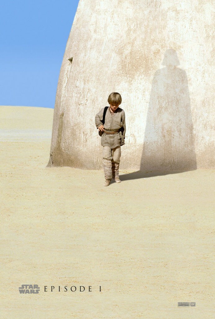
Flash forward to 1999 when Perkins and his friends went to see The Phantom Menace in theaters. “I remember the movie poster was incredible and really gave me pause,” Perkins says. “It was an image of Anakin Skywalker as a young boy, alone in the desert, and as his shadow extended away from him it morphed into a silhouette of Darth Vader. It was refined, simple, emotional, and clever. It somehow conveyed so much with so little and I found that intriguing.”
When it came time to work on design concepts for the new collaboration with Corkcicle, Perkins found himself thinking about that poster. “If we could somehow capture a bit of those same aspects -- we’d have something special,” he realized.
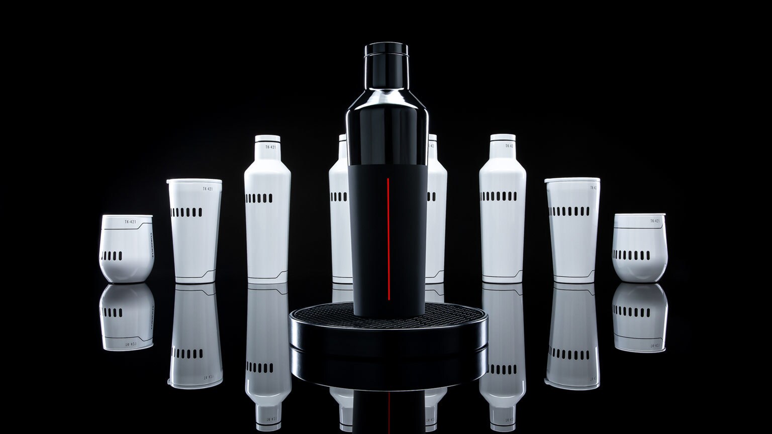
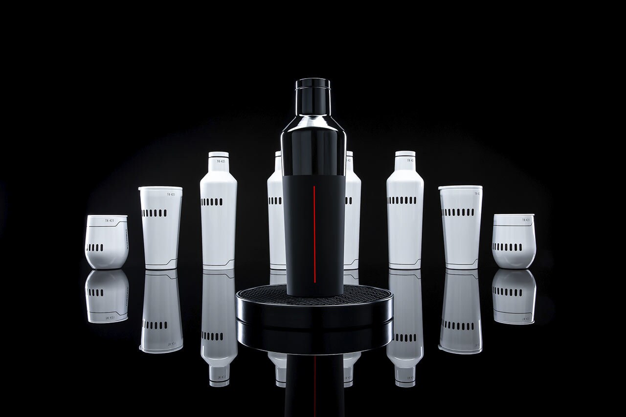
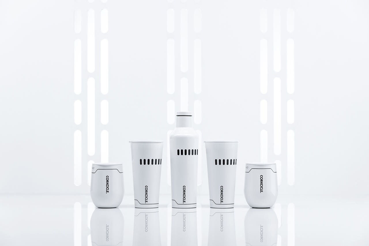
It’s only fitting that Darth Vader helped set the tone for the line of drinkware, just announced today. The range of triple-insulated stemless cups, tumblers, and canteens help regulate temperature to keep cold beverages chilled for up to 25 hours and hot drinks suitably warm for up to 12 hours. In other words, the Rebel Alliance would probably have loved to get their hands on these canteens, as useful on the snowy plains of Hoth as the sands of Tatooine.
Recently, StarWars.com sat down to talk to Perkins about his love of fusing Star Wars and subtle design concepts to bring the mood of several classic characters into the new line.
StarWars.com: The designs are so elegantly understated. From a design perspective, why create drinkware that is subtle yet still readable as part of the Star Wars galaxy?
Greg Perkins: Star Wars means a lot to a lot of people and its fandom is quite broad. There was this phrase we kept saying as a team throughout the process, and it was “If you know, you know.” For us, that meant exploring iconic elements within the Star Wars canon (wardrobe, sets, props, etc.) and finding ways to represent them with minimal gestures that are obvious, but not necessarily overt. We hope this approach can both please and delight the die-hard fan but also become something that anyone within the wide spectrum of Star Wars fandom can appreciate.
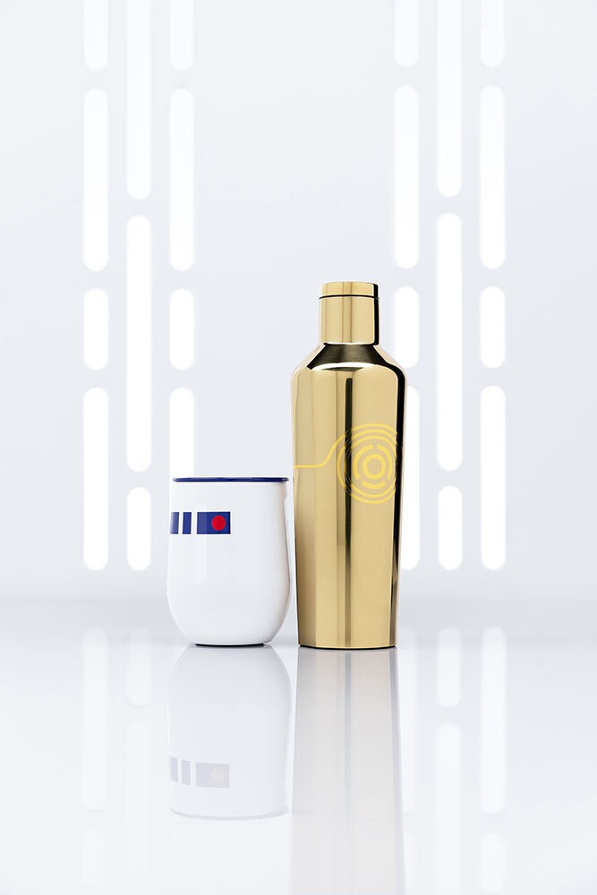
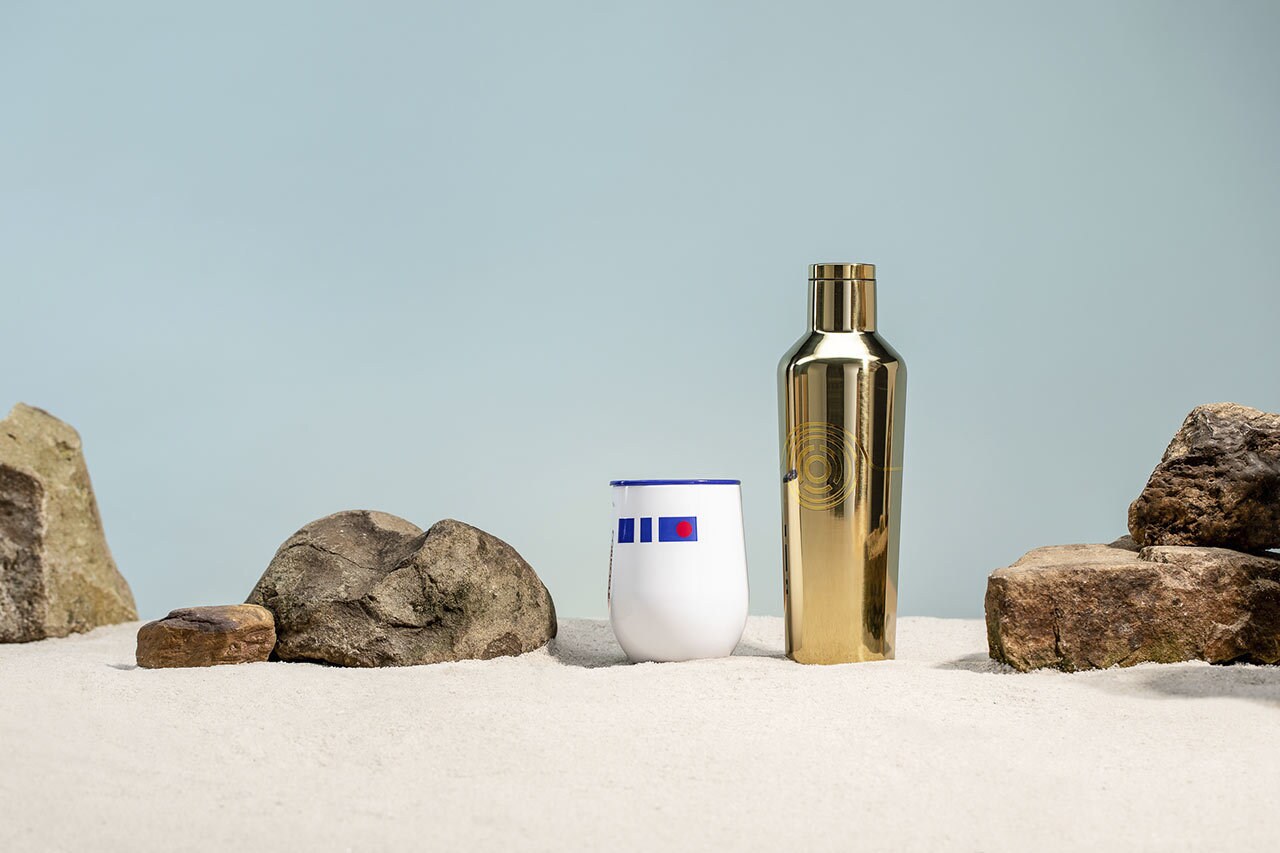
StarWars.com: The droid duo looks particularly great together! How did you decide which characters to include in the line?
Greg Perkins: We explored many different designs in the early stages of the process. Some were character-based, while others were not. Through that process, we saw a through line of designs representing classic characters rise to the top, making a cohesive product line. After that, we took a good look at the mix of characters we were working with and saw a natural theme of good versus evil -- the Rebellion versus the Empire -- and that dictated the blend of characters.
That theme really came through with the marketing materials. It was a great fun to build sets, work with character pairings, and create elements that further told that story.
StarWars.com: What was the biggest challenge in your design process?
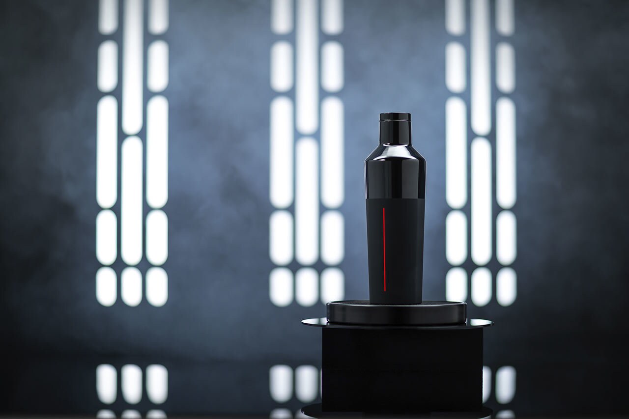
Greg Perkins: Finding the balance of subtlety and clarity in the designs. We were circling around the concept for the Vader design pretty early on the process. We knew we wanted to utilize different finishes to represent his outfit from head to toe. We settled on a gloss finish for the top of the product to play off the highly reflective qualities of his helmet and a soft touch finish on bottom relating to his cape. That was interesting and certainly felt right, but wasn’t enough to actually relate to the character. We tried a few things and eventually settled on a single red line in a foil finish to resemble the glow of his iconic red lightsaber, and also represent the evil of the Empire. That design sort of became the benchmark for what we wanted to achieve for each character, so the challenge then became trying to hit the same mark for each design -- to use as few elements as possible while maintaining a strong visual connection to the character they were representing.
StarWars.com: Do you have a favorite character or design?
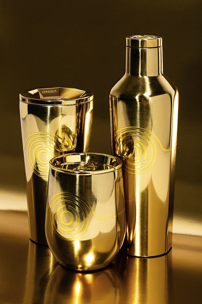
Greg Perkins: I think my answer to this would change every day! Right now, it’s probably the C-3PO design. That highly reflective gold and the gold foil medallion really makes me smile. I can look at the product and just imagine it saying “Oh, dear.”
Order drinkware from the Star Wars x Corkcicle collection now.
Associate Editor Kristin Baver is a writer, host of This Week! In Star Wars and The Star Wars Show Book Club, and all-around sci-fi nerd who always has just one more question in an inexhaustible list of curiosities. Sometimes she blurts out “It’s a trap!” even when it’s not. Do you know a fan who’s most impressive? Hop on Twitter and tell @KristinBaver all about them.
Site tags: #StarWarsBlog


