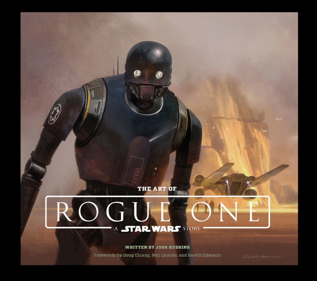
The Star Wars legend discusses creating a Sith Lord's castle, menacing new stormtroopers, and much more.
For Doug Chiang, Rogue One wasn't just the first Star Wars stand-alone film. It wasn't just the telling of a major tale in Star Wars lore. It was, as StarWars.com found out in the interview below, something much more personal: the chance to really fulfill a childhood-turned-professional dream. As Lucasfilm's VP and executive creative director, Chiang, a peerless concept artist, has been a key figure in crafting the look of Star Wars since the prequel trilogy. But Rogue One took Star Wars back to the future, as it were, with a story set right before the first film made in the saga, A New Hope. This meant that Chiang, co-production designer on Rogue One, would need to design ships and characters and creatures that were visually in sync with the movie that started it all -- and the movie that made perhaps the biggest impact on his life. It was a unique if not ironic challenge, and the creative journey -- of Chiang and many more great Lucasfilm designers -- is documented in Abrams' beautiful The Art of Rogue One: A Star Wars Story, available now. Armed with spreads from the book, of which Chiang wrote the foreword, StarWars.com visited the artist in his office to discuss creating Episode IV-style designs, the dark-side architectural theory behind Darth Vader's castle, and why thin stormtroopers are actually scarier.
StarWars.com: I wanted to read something that you wrote in the foreword to The Art of Rogue One. “Like myself," -- and you're talking about Gareth [Edwards] -- "he held Star Wars: A New Hope as the benchmark of excellence for cinematic design. And because the story of Rogue One takes place before the events of A New Hope, and in fact directly links to George’s original film, we knew our new designs had to dovetail seamlessly with it. This made our design mission even more daunting.” I'm wondering if you can you talk about that, because it’s interesting to me that you worked on Star Wars films that have taken place before the original film and have taken place after. So this was kind of the chance to do something that was actually, very specifically, [in the look of] the original Star Wars. What was it like going into that?
Doug Chiang: I was so influenced by Episode IV in terms of the design. That’s what I grew up with. I spent my high school days just drawing Star Wars designs from Episode IV. So when I finally got a chance to work on Star Wars with George [Lucas] for the prequels, I thought I was going to do that. You know, just draw nothing but Ralph McQuarrie and Joe Johnston designs that were exactly like Episode IV, and [Lucas] was the one who said, "No, we’re gonna design a little bit earlier and kind of establish the design vocabulary for Star Wars,” which was great. And then on The Force Awakens, it was a similar thing. Because we were not going to design specifically for Episode IV, but we were going to do a projection of 30 years forward and what the evolution of that design would be.
So for me, the excitement was, for Rogue One, the opportunity to actually go and tap into that desire that I had -- that fire -- of drawing an actual Episode IV design. It’s something that I’ve always wanted to do, but you realize that when you’re actually doing that, it’s also fulfilling something that’s very daunting, because I have such great respect for those designs. In my mind, they’re some of the purest and most successful cinematic designs, and to think that we could even sort of design elements in our film that would hold up to that same bar was just really daunting. But I loved that challenge, and that was the same challenge that Gareth really demanded of us, which was, "Let’s set the bar as high as we can." Because both of us, Gareth and myself, hold Episode IV design as the high bar for cinematic design, for this kind of film. So our goal was really, "Here’s the bar, let’s try to reach up to it." Even if we don’t succeed, at least we’re striving for some excellence.
It was kind of frightening. The first couple of days, you think you know Star Wars, but when you actually try to draw your version of the X-wing, it’s really hard. In some ways, Joe Johnston nailed the proportions, and for me it's really hard to improve on that. You can't change the proportions to make it better. So that was the thing that was an interesting lesson that I learned. You can take the visual language of Star Wars, the design language that has been established by George, and you can kind of do your interpretation of that, but you’re not really directly comparing it to anything that has been established. In Rogue One, we were doing exactly that. We were designing the U-wing to fit exactly with the X-wing, and so that made it a lot more challenging for us.
StarWars.com: I’m pretty sure, from early on, that Gareth had the idea that this was going to be a war movie. So even while you were aiming to do Episode IV designs, did that also influence the way you were going to approach things visually -- that this was going to be a grittier Star Wars movie?
Doug Chiang: Yeah, exactly, and it did quite a bit. Gareth’s sensibility, in terms of his director's point of view was, he wanted to make this a little bit grittier, in some ways a little bit more a mature version of Episode IV. And with that as a grounding underlay for our design, we started to reference real world history. Gareth really felt that if Episode IV was grounded in World War II aesthetics, maybe we should ground ours in the Korean War or Vietnam, in terms of coming up with vehicles that would fit into that language. When we designed the U-wing, it was precisely that. Gareth wanted a Huey helicopter version of the X-wing, and that was the design brief from Gareth.
StarWars.com: I wanted to talk about something else you discuss in the foreword, which is the "gray area" of Star Wars design -- that you can experiment with Star Wars but you can also break it if you go a little too far. So how would you know when you were breaking it?
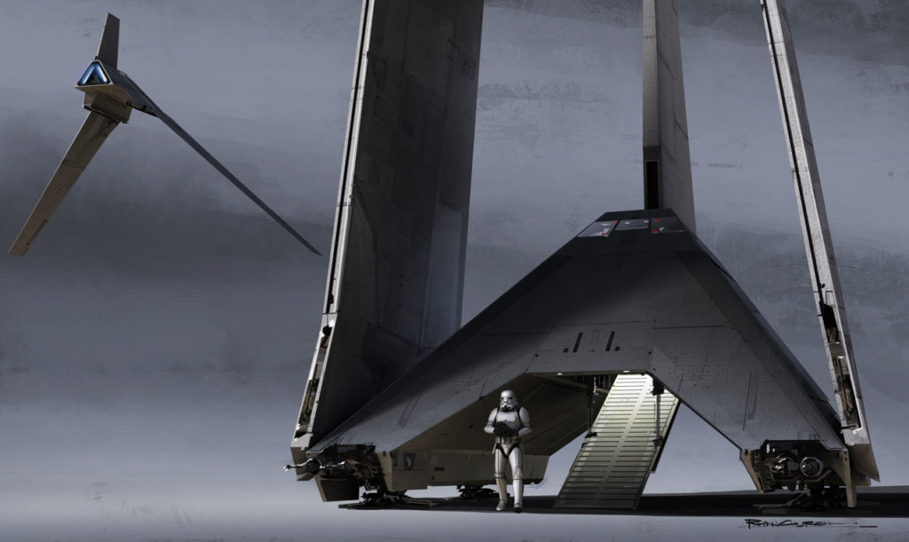
Doug Chiang: The gray area of design for Star Wars is very tricky, it’s almost an instinct that you have to develop. It’s obviously very easy to design things you may think would be a variant on the X-wing or the TIE fighter, but the Star Wars universe is so broad. George established such a broad designscape, in terms of the evolution of designs for Star Wars, that we felt that it was imperative to expand on that. And I love that gray area, because that's where you take the most risk. That's where you bring in something fresh, something new, a new point of view for design, but yet still grounding it in reality and still grounding it in Star Wars. For me, I felt that was very important, because George always added an element of a new design, a fresh design, for each of his films, and we really want to do that. We didn’t just want to recreate the designs that we saw in Episode IV, we wanted to add something new. So we brought in things like Krennic’s shuttle and the mining shuttle. Both of those were heavily grounded in Star Wars aesthetics, but we reconfigured it, we added an element of new. For Krennic’s shuttle, it was actually bringing a little bit of Episode III designs -- the stealth technology, to sort of update shuttles, and it gave it an interesting personality. It gave it a really aggressive, stealth-like ship look that we hadn’t seen before, and yet the skyhopper configuration is so grounded in Star Wars, that having that new material with that as the basis, I think gave new freshness as to what the shuttle could be.
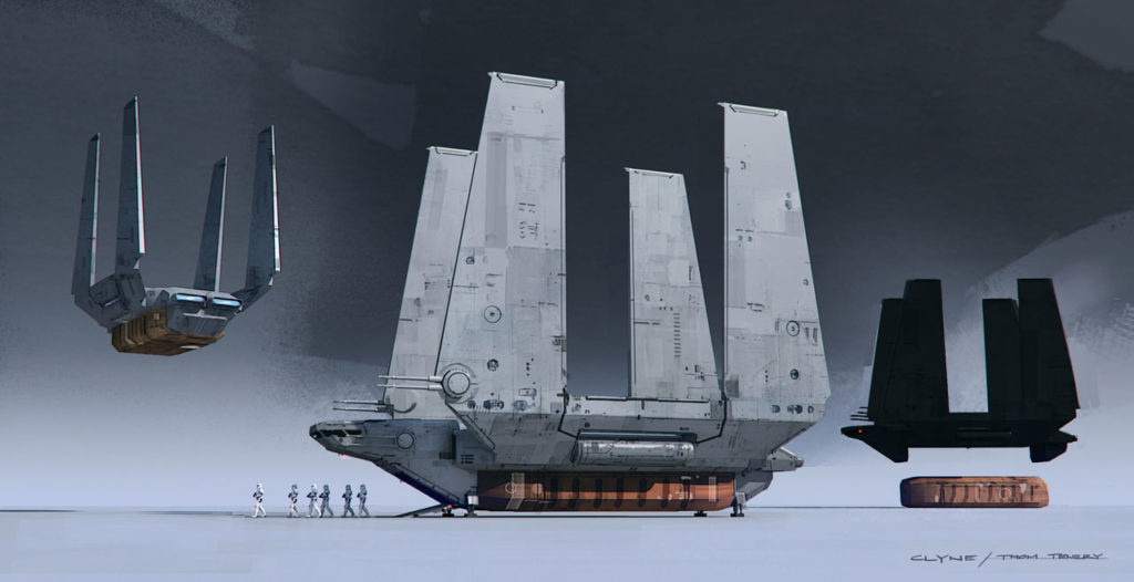
I think the mining shuttle was very similar to that. We kind of knew we wanted a larger cargo ship, and we obviously started with designing sort of a bigger version of Vader’s shuttle [from Return of the Jedi]. I’ve always loved the idea that the wings folded down, and that when it landed the wings folded up. So we started playing with, "Well, maybe instead of three wings, it could be four," and there was something really intriguing for me. When I first saw the sketches of the mining ship with the four wings up, it really reminded me of Viking sailing ships. When they would come in to dock, they would, basically, put their oars straight up. It was such an interesting, sort of subliminal connection that I had. I loved that shape. So we basically started to take that configuration and refined it a little bit more. Now, the finished design has a strong foundation in Star Wars shuttles, even though this is a slight variant on the [Return of the Jedi] Tydirium shuttle. If you look at the nose of the mining shuttle, it’s very similar in proportion, even though the cockpit windows are slightly different. So it almost feels like it came off of the same manufacturer.
StarWars.com: What kind of research did you do for Rogue One? Did you go back and look at Ralph McQuarrie and Joe Johnston designs to make sure you and the team were coming close?
Doug Chiang: Yeah, that’s one of the great things about working on a film like Rogue One. We have the strong foundation of Episode IV. There’s tons of sketches and designs that Ralph McQuarrie and Joe Johnston designed, but they were never used. We kind of went through all those rough thumbnail sketches to see if there were any nuggets of designs that we could actually adapt and update for our movie. Granted, a lot of those designs were very specific for the story that George was telling. But what I was looking for was the form language, in terms of things that they were exploring that perhaps went down a path that wasn’t quite right for Episode IV. If there was a potential that we could update it and use it for Rogue One, I was very intrigued by that idea.
StarWars.com: I want to go through a couple of the spreads from the book, and have you comment on the art and what you or the team were going for, and how you maybe got from here to what ended up in the film.
Doug Chiang: Sure.
[StarWars.com takes out some printouts of pages from The Art of Rogue One.]
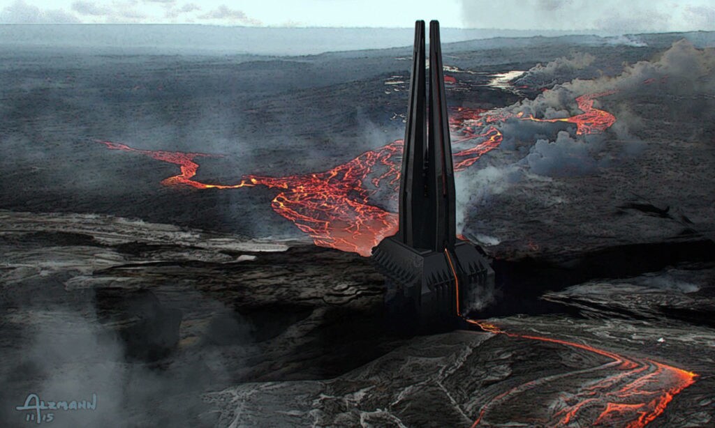
StarWars.com: To start, this was the thing that really made me jump out of my seat...which then made my wife scratch her head a little bit. Vader’s castle.
Doug Chiang: [Laughs] Vader’s castle was really fun. When I knew that we were going to possibly go back to Vader’s castle, I loved that idea of, "Okay, lets establish Vader’s home." The initial idea was, "Why would Vader live here?" In our minds, we started to come up with a little bit of a backstory. That perhaps this place had special meaning for him, and that this is where he comes to meditate and to heal himself. We started with the idea that maybe it should be built around his bacta tank chamber, and he comes back here to rejuvenate himself and also to meditate. So from there, the structure itself grew out from the bacta tank, and there were certain ideas that we tried. We were trying to go for a very iconic shape, and we always love tall towers. Ralph McQuarrie actually drew quite a few small thumbnail sketches [of Vader's castle] that were very intriguing. They were kind of angular versions of a tower, and I saw the potential of where he was going, and I just exaggerated that quite a bit.
One of the things we landed on early was this idea of a tuning fork -- a twin tower kind of look. And it was really interesting, because then that started to give Gareth a lot of ideas like, "Well, maybe the structure is built this way because it is like a tuning fork. It's tuning the dark side in terms of the energy." And then we actually carried that even further to Jedha. The Jedha temple, the tower there, mirrors this but on the good side. So when you see the film, you can start to see, "Okay, Jedha had its own tower, which was configured like a tuning tower. Vader’s tower, Vader’s castle, had the same thing but it was made in black, whereas Jedha was white." You kind of start to see the good and the bad. You may not really notice it on a first take, but hopefully it’s that foundation of design subtleties that then the audiences, on second viewing, will appreciate. And I always like to build those elements in there because it makes the design more coherent, it makes the film more coherent, and overall it makes the design language very authentic and real.
StarWars.com: There’s also the note in here -- I think you said it -- that there is a Sith cave underneath. Where did that come from? It's funny, because you’re watching the movie and you have no idea that there could be a Sith cave under there, but then you read it in the book, and you’re like, "That’s awesome and that makes sense."
Doug Chiang: Exactly. It went back to the original idea of, "Well, why would Vader be here?" and there was a series of paintings and sketches that Ralph McQuarrie did, where Luke actually visits Vader in this underground lava cave. I always thought that was such a compelling image, because you have this lava lake inside this cave and there was Vader’s throne. So we took that idea and thought, "Okay, well, maybe on the lower levels of Vader’s castle, there’s a more ancient part. That he actually built this castle on a foundation of an ancient structure." If you look at the finished design, it has this very strong element of a structure that was there for a purpose, and that purpose was to draw energy from the lava lake. If you look at the design of the base, it feels very much like a dam, and how the lava flows through it, possibly getting energy. And so we thought, "Okay, well, that’s the foundation. Maybe even deeper, or underneath that, is an even more ancient part, which is a natural cave where Vader goes to meditate." Visually, we’re trying to create a sort of history for the tower. The bottom is the most ancient, the lava lake dam part was perhaps what Vader built his foundation on, and then the tower was Vader's addition.
StarWars.com: The U-wing. I know you’ve done interviews where you talked about going through hundreds of designs.
Doug Chiang: 781. [Laughs]
StarWars.com: What was wrong with the first 780?
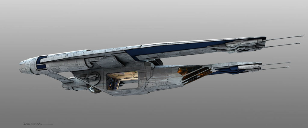
Doug Chiang: [Laughs] It’s one of those things where we knew the U-wing was going to be very challenging, because the mandate from Gareth was, "Okay, let’s create our memorable ship that’s going to be comparable to the X-wing or the Millennium Falcon." In my mind, those are two of the most perfect designs. So in order to design our ship to compete at that level was just mind blowing for me.
We started off with, "Okay, what is it that we really need for the story?" One was that it was a troop carrier, and so it was a Huey helicopter version of the X-wing. So we started with that foundation, but with the idea that you can configure the wings in a hundred different ways, if not thousands. And so what we started to do was to come up with the local version of that ship, something that’s graphic, that’s very memorable, something that a child could draw. From there, once we kind of came up with this U configuration, it was really then trying to refine the proportions of the wings to the engine to the body, and this is where the appreciation for design like this may be lost on a lot of the general public. Because it’s kind of like, if you look at automotive design, you have the same package: four wheels and a body. Yet there are hundreds of variants on that and some are real classic, and some are kind of more generic. It was the same problem here. What we discovered is that when you change proportions of the wing, you have to modify the engines. Or if you modify the engines, the body has to get wider. So everything affected one or the other, and that’s where we started to play around with the designs, because the minute you changed one element, it would actually force you to rethink another element. It became a very organic design. All the hundreds of designs that we were doing was [us] trying to find the most perfect design, in terms of what worked for the story, how Gareth wanted to shoot it, and also the ideal version of a memorable ship. And that’s a very challenging task. The final version, I think, is very successful, and it looks very obvious, but getting to that obvious is always very hard.
StarWars.com: Is it the hardest ship you’ve ever had to design or played a part in designing?
Doug Chiang: Absolutely. This is definitely by far the hardest ship, and it's because we set the bar so high. If you were to ask, "Here, design your version of the Millennium Falcon," that would be mind-blowing because the Millennium Falcon is so perfect, and there’s not a thing on it that I would change.
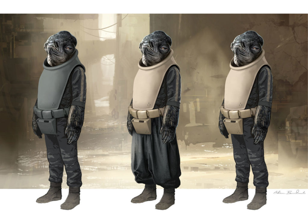
StarWars.com: I want to talk about characters a little bit. We’ve seen Mon Calamari, but Admiral Raddus is just a little different.
Doug Chiang: The actual specifics about it, you should speak to [head of the creature shop] Neal Scanlan, but the idea was that Gareth loves the classic characters from Star Wars, in terms of the species. But then he thought, the universe is so broad, you can have variations on them. You can have an albino version of the Mon Calamari. And once you start to think about it and compare it to the real world in terms of our society, it opens up a lot of different possibilities and variables. The main thing, though, was to really build in the right personality, and for Raddus it was this sort of scruffy Admiral-type character. I believe Neal Scanlan and his crew actually referenced Winston Churchill, in terms of the mannerisms, the look, and the facial features. When you can ground the design in something that we can relate to, it makes that design seem more real, even if you don’t quite know that relationship. It just gives that final design a grounding in reality.
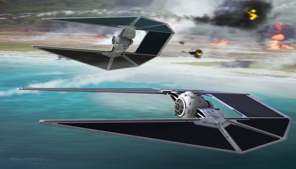
StarWars.com: What can you tell us about the TIE striker?
Doug Chiang: The TIE striker was really fun, because we wanted to come up with a new TIE fighter. Something that would be very specific to Scarif. We looked at all the different possibilities and they were all very interesting, but we wanted to come up with something that was very unique, and again, we kind of referenced Vietnam-type aircrafts. We thought, "Okay, well, helicopters are such a key item. Maybe the TIE striker should be the Imperial version of a Huey helicopter." So I started to take the idea of the wings -- instead of the TIE fighter wings where they are perfectly parallel, we put them up on top. And what happens is that, graphically, when you see the silhouette of the striker on the horizon, the black wing that’s on top starts to remind you of the rotor blades of a Huey helicopter with the body underneath. That was a very striking, memorable image, so we kind of wanted to build on that. Part of our thinking was, okay, maybe the striker is specific to Scarif because it’s an atmosphere fighter. It’s made, specifically, to defend Scarif.
StarWars.com: To go back to what we were talking about earlier, "the gray area of Star Wars design," how would you know, let’s say, with the TIE striker, that it was working and you weren’t pushing it out of the realm of Star Wars?
Doug Chiang: We did push it out of bounds, and quite a few times. It’s one of those things where you do have to find where that boundary is, and you’ll know instinctively once you’ve kind of crossed that boundary, and then you just pull back a little bit. For the TIE striker, it was, really, coming up with a unique shape, and I think the compromise that we came up with was walking that real fine line of pushing the design too far and also being true to Star Wars. It’s a real beautiful blend, because we gave it the practical realism of why the wings are where they are, but then on top of that, the shape of it reminds you of bats. And so that gives it a really strong personality. Almost an evil, menacing-type personality. You have to find all those things. Design for a Star Wars film, I think, is very complex, and it's because you're riding that fine line of pushing something as far as you can to make sure it’s still Star Wars, yet adding something new. But then imbuing it with personality, imbuing it with function, and imbuing it for what is needed for the actual narrative of the story.
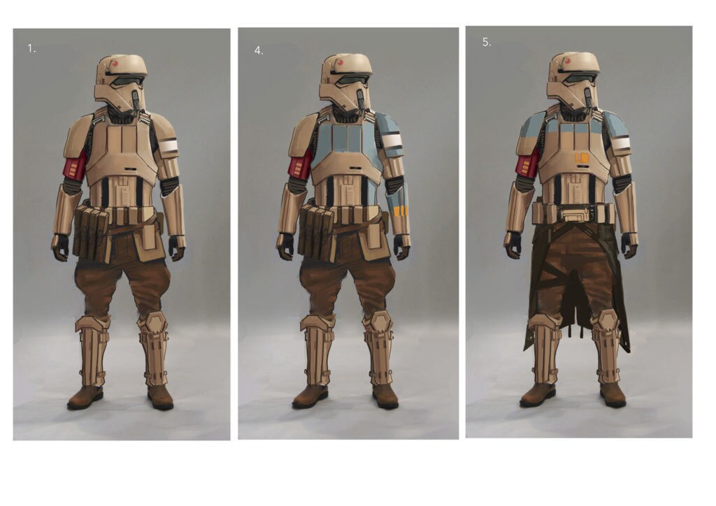
StarWars.com: The shoretrooper armor. It's interesting here, because even with just the small color changes, it goes from looking like traditional stormtrooper armor to looking like something very different.
Doug Chiang: Yeah, the shoretrooper was one of the great examples where we realized, "Okay, maybe stormtroopers have very specific armor for specific locations and terrains." And the world we referenced was Endor. We had the scout troopers because they were specific to Endor. So we thought, "Why couldn’t we have a stormtrooper version that’s specific to Scarif, that could be on the sand and in the water." Gareth always really loved the scout trooper, as did myself. Some of the early ideas that [co-costume designer] Glyn Dillon explored was to take the scout trooper helmet, in terms of that biker look, and merge it with a regular stormtrooper. And then we also thought, "Well, because this film happens before Episode IV, there’s maybe an opportunity to bridge a little bit of the clone troopers in here, as well." So we brought those elements into this. The final design, I think, is a real nice blend of the clone troopers with the scout troopers with stormtroopers, that’s very specific for Scarif. Gareth always wanted a stormtrooper that was kind of warm-toned, kind of sand-colored, to make it make sense that they were on Scarif with the sand. But then Glyn actually modeled the color scheme on the [WWII fighter] Messerschmitt, where the base color that was sort of tannish, but then it had patches of this blue and orange that were so elegant. Again, it makes that reinforcement of connecting it with something that we know from history, it makes that connection to Episode IV, which was World War II technology, vehicles, and colorations. So the shoretrooper, I think, is a wonderful blend of all those requirements into something new.
StarWars.com: There were a lot of great Imperial designs in Rogue One. The shoretrooper, the death trooper, even Krennic’s uniform was kind of different than anything we’ve seen. What was, overall, the goal for Imperial design?
Doug Chiang: In some of the early design discussions, Gareth felt very strongly that we should make the stormtroopers and any of the Imperial guards very menacing. He always felt that when you add costumes onto a guy, if it’s an athlete, it tends to bulk them up and turn them into football players. He always wanted something more elegant, as if we took very thin athletic warriors and just clad them. He always wanted to go for that real thin, elegant look.
There was a sketch of an early stormtrooper that Ralph McQuarrie did for one of the production paintings of the Death Star. It was a really sleek interpretation of a stormtrooper, because Ralph had this amazing ability to stylize figures. His figures were always very elegant and very tall and very thin, and Gareth just loved that, and I love that, as well. And we thought, "Okay, how do we do that? How can we actually bring that to the designs that we were doing?" Because there was a menacing elegance to those proportions. One idea was, Gareth wanted to cast very thin athletes, and he thought the thinner they are the more menacing they’ll be, because they're just super athletes and they just look very lean. Part of the early explorations that we did for the death troopers was that maybe we can cross that line, so that it confuses the audiences a little bit. Are they robotic or are they human? So we made them a little taller, a little thinner. But early on we actually explored the idea that maybe they are actually robotic. Ultimately, we decided they would be more menacing if they were human, but we kept the really thin, elegant proportions.
StarWars.com: I asked Gareth about connecting Rogue One visually to A New Hope, and he mentioned how in the opening scene he used an inversion -- in A New Hope you have Darth Vader flanked by white stormtroopers, and here you have Krennic in white flanked by black death troopers. Was there more of that throughout the design process?
Doug Chiang: Yeah. I love those inverses, because Gareth always described Rogue One, the storyline, as the inverse of Episode IV. Whereas in Episode IV, you had a farm boy who dreamt of being a warrior, for Rogue One, it was the warrior who dreamt to go back to the home life. So you already have, story-wise, a reversal, and even character arc-wise, a reversal. So it was an idea to play with that visually, and it's a fun thing because it’s a motif that’s in there. In my mind, when you layer those in there, it adds more depth to the movie.
StarWars.com: Watching the movie, are there any of your designs that surprise you? Maybe, "That worked out better than I thought it was going to."
Doug Chiang: Yeah, there are many. It's interesting. Rogue One has been one of the best experiences for me, just because of the designs, I thought, were very successful. And that speaks to the whole team, in terms of their work and what they brought to the table. So I look at it now and I enjoy it as a fan. I really look at it as a fan and say, "This is the Star Wars movie that I’ve always wanted to see, these are the designs that I’ve always wanted to draw." And so with that in mind, the first time I remember seeing the whole film together, with final mix and sound and music, was at the premiere. Even though I had, at that point, seen the film several times, it was such a treat. It was very refreshing. Sometimes you get so close to a project that you can’t judge it. I was so close to this, but yet it still made me smile, and that's when I realized we succeeded. Because, ultimately, we were trying to make a film for fans, and we were the fans, and we were trying to please ourselves.
StarWars.com: For you personally, now that The Art of Rogue One is out and you're so heavily involved in the work that's featured in it, what does that mean to you?
Doug Chiang: It means the world to me, because Rogue One is the film that I’ve always wanted to do since I was 15 and I saw A New Hope. My whole career has been built on getting to that moment -- of actually designing things that fit within Episode IV, and to finally have a chance to do that and to have the film succeed at that level, in terms of design, is very fulfilling.
Dan Brooks is Lucasfilm’s senior content writer and editor of the StarWars.com blog. He loves Star Wars, ELO, and the New York Rangers, Jets, and Yankees. Follow him on Twitter @dan_brooks where he rants about all these things.


